No please, don't go away. I promise typography is interesting
No please, don't go away. I promise typography is interesting...
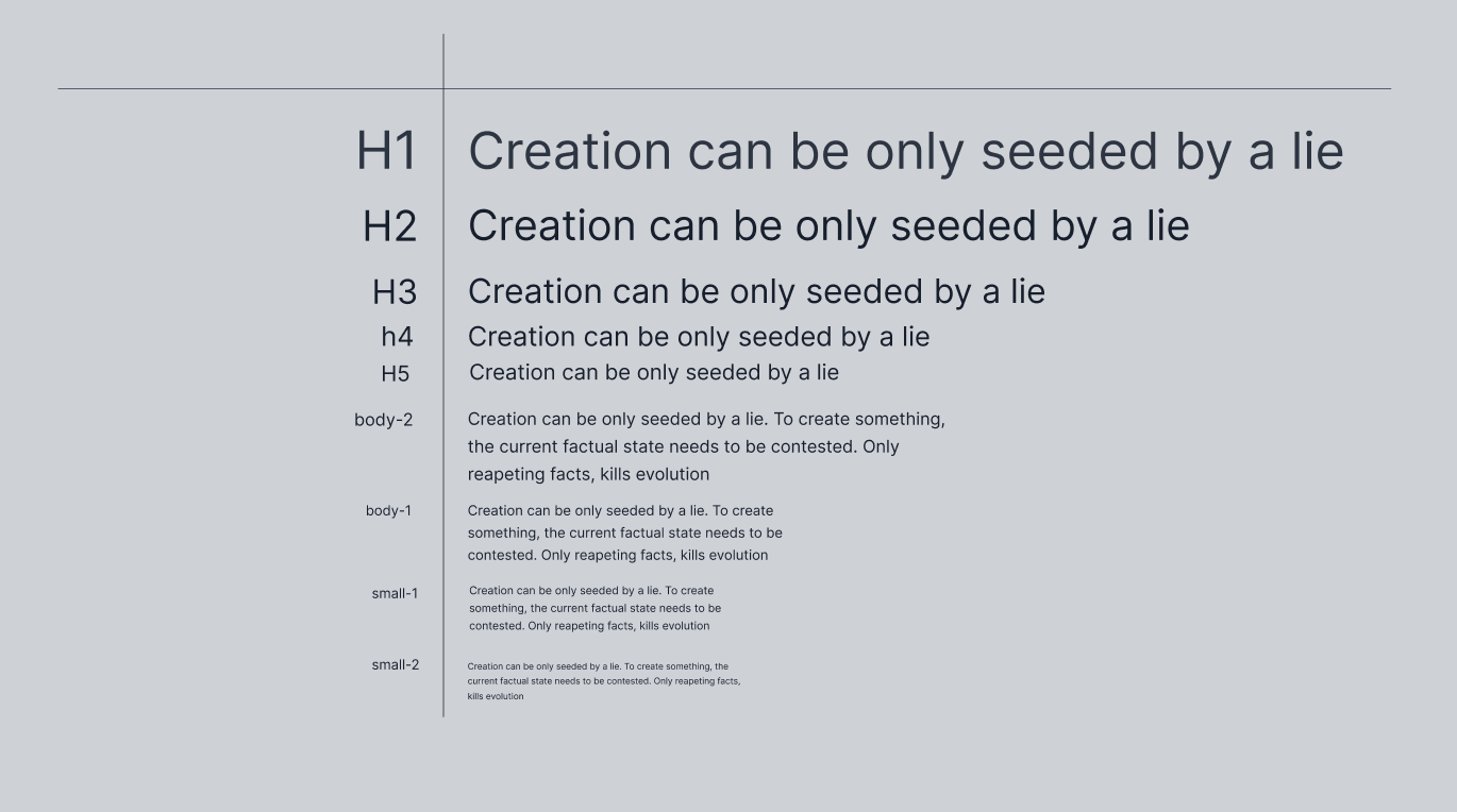
From the beginning when I decided on a genre for my game, which is a card game, there was one top priority for me. Which is typography.
We live in age where text is not the preferred media. Yet, even games that decide to be less verbose with their text, will need on some point to communicate to the player something by text. I feel this is especially important for us indie game devs, as we cannot afford to pay voice actors to add explanation by a deep trained voice.
Knowing is one thing but acting is another. As I have focused on things like drawing new assets for my game, thinking of lore, composing some music (none of which is in the game by the way on time of writing this), I put the task of choosing typography for later. This was a huge mistake.
When creating pixel art, I have found comporting that my assets will be so small. Assuming I can just scale the fonts later. I designed some nice looking cards, exported sprites to figma and put a pin into it. Happily putting task for "add nice looking fonts to game later"

Unfortunately, this proven to be impossible to implement so easily in godot (probably same issues would occur in other engines).
As the fonts with desired sizes were to big for small 64px sprites

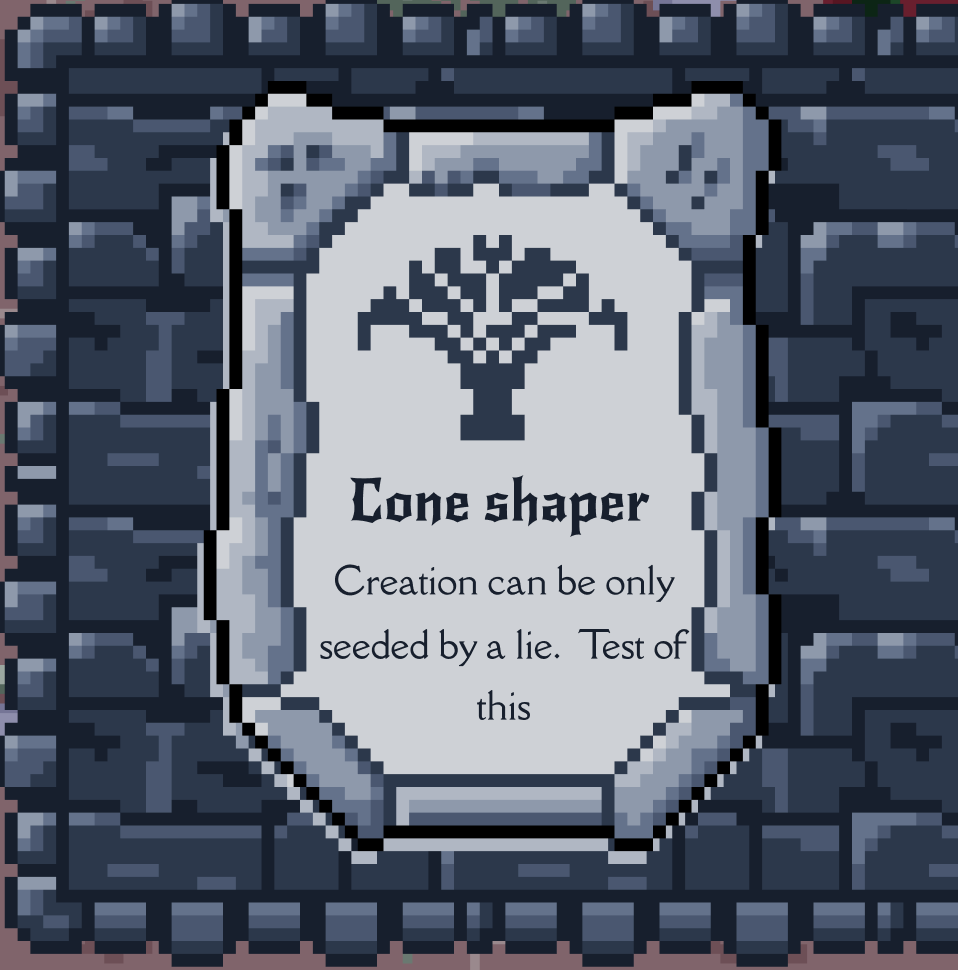
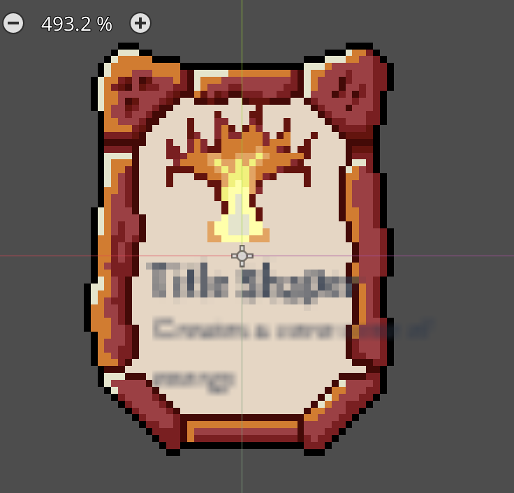
When using fonts that would fit on my rectangles they got blurry. Even small pixel font styled font faces would be to big for those sprites. I got an advice somewhere to use desired font sizes and use "scale" property to scale them down to desired size. Unfortunelty the effect was the same.

Solution: re-export all the sprites with 300% size, replace them in engine
lesson learned: always start with typography
Get Ace of Spells: Mok`vel tomb
Ace of Spells: Mok`vel tomb
pixel art deck building card game, turn based
| Status | Prototype |
| Publisher | |
| Author | DawidGaleziewski |
| Genre | Card Game |
| Tags | Deck Building, Pixel Art, Prototype |
| Languages | English |
More posts
- First release - hello worldNov 07, 2024
Leave a comment
Log in with itch.io to leave a comment.